Grower app
- UX & UI Case Study -
- UX & UI Case Study -
Farming is a complex and ambiguous operation; farmers often don’t know how much money a crop they have spent a year growing will make for them right up until the moment it is sold. This makes being a stakeholder within a growing operation highly stressful due to the unknown margins.
The Grower App is the single digital tool for managing a perennial growing operation such as apples or pears. The app itself aims to provide growers with the data and insights needed to accurately estimate and manage their P&L a long way before the produce goes to market.
The app itself houses multiple feature sets that cater to a plethora of different users. Each feature not only aims to optimise a growing operation from a data first perspective, but also provides baked in functionality to allow growers to maximise their carbon efficiency and sequestration potential. Growers natively have the capability to be a solution to climate change, however they do not possess the data or technical knowledge to unlock this potential. The Grower App aims to solve this with a comfortable and accessible experience, tailor made for specific stakeholders throughout the growing supply chain.
The following is an outlined summery of the design process that occurred over the Q3 period of 2021. I was the sole designer within the business at this time and performed all of the design tasks outlined bellow.
Farming is a very complex and delicate operation. This is especially the case with modern forms of ‘conventional’ horticulture where often much of the growing process is proscribed via professionals such as agronomists, and managed via chemical product such as fertilisers, pesticides and fungicides with the aim of maximising yield/margin. To immerse my understanding of the processes involved within a perennial growing operation, an intensive discovery period was paramount. Bx itself was incubated within an established large scale growing operation for this very purpose: discussing, questioning and learning was a daily operation that forever changed the way I think about my produce.
Over the space of a month a full discovery process was executed to not only inform my future decisions as a product designer, but also allow the business to better understand and shape our vision/brief. In practice, I follow a common model of process called the Double Dimond. Working with this model not only provides great flexibility with the variables of different briefs, but is ridged enough to ensure due diligence is given to my working assumptions within a given design.
Due to the large amounts of subject matter expertise that resides within the farming community, I deemed it pertinent to start with an in depth stakeholder interview sprint. During this time eight separate departments within a growing operation were targeted over 15 different interviews. The data received was highly informative and allowed much greater understanding of the problem. Both quant and qual were collected to provide different perspectives to our analysis of the problem.
All users are dissatisfied towards the existing business management tools or systems.
Emerging groups of user types can be seen when considering their level of understanding: those who fully understand, those who moderately understand and those who have a clear lack of understanding.
Vast majority of personas voiced their desire for a single system in the future that performs end-to-end and provides all required functionality.
Direct competitors have little likeness to the LOOOP vision due to their inability to perform end-to-end. We should look to big tech for competitor examples such as Apple, Amazon and Tesla.
The new systems design and build should be human centric, with user requirements at the core of all new implementations. Initial implementations should have distributed focus across all user personas as the new system will affect everyone in the business.
Personas often have a perception of the business being reactive, not proactive to events.
Other discovery techniques such as user testing and competitor analysis were also conducted within this discovery period to provide great context to the finding of our stakeholder interviews and the larger problems at hand. A comprehensive summary of the findings were played back to the business to share the knowledge learnt over this period.
Take a look at the full discovery playback to learn more about this stage of the process.
View deckPost discovery playback, I ran multiple workshops to quickly generate creative ideas that aimed to solutions against our problem of a data poor supply chain. During our workshopping sessions it was key to narrow down some of the findings surfaced in the discovery period around a lo-fi form that started to look like a solution. To do this, mapping each persona to their desired requirements via user stories that had already been produced allowed us to build a cohesive master flow of what the supply chain looked like.
Having a diverse set off individuals, not only in terms of subject matter but also cultural background, was key too quickly and successfully surfacing and navigating possible scenarios of thought and logic.
Once the problem was properly understood and defined via workshopping exercises, ideating towards a solution could then be performed independently. In context to the brief, this took shape as individual design architectures for each given persona that could be quickly sketched and iterated upon. These architectures can used for further, more focused documentation, such as flows and individual information architectures (IA’s).
Working as lo-fi as possible, specifically at these very early stages in the design process, allows for mental models to be quickly put to paper and shared with stakeholders. This process of sketching and critique is vital to not only refining the final output of the product, but also brining everyone in the product team and wider business along the journey. Experience has taught me that without cohesive mental models at this early stage, later stages of the design process can be fraught with misaligned expectations across many different areas of a business. This can lead to tough situations such as under resourcing if not swiftly remedied .
Now that individual user stories for given personas have been mapped into critiqued architectures, higher fidelity interaction for the user experience can be mapped via flows. In this project, it was still pertinent to have a global perspective of how those flows interacted with one another within the architecture. To do this a larger scale experience map was utilised, this enabled a full picture of the proposed experience to be modelled whilst still encapsulating multiple personas within a single entry point.
Another defining factor for choosing to adopt this large scale experience map is to also enable the full perspective of the proportions of the proposed application. There is always some form of minimum viable product (MVP), especially when concerting a new stand alone product. Having this solidified mental model again provides stakeholders with a cohesive picture of our proposed solution. From there, collaboratively it is the task of the product team to scope what gets brought forward for production and at what stage. I as a product design at this stage step away from the experience map without ego and hold the voice and requirements of our users, all justified by data obtained in discovery, to maintain the correct functionality is brought forward.
I very much believe that to be a good product designer, one must go into every situation with as little ego as possible. In my opinion, the role of a product designer is to simply be a vessel for which data and insights are collected, weighted and collated from three sources: our users, the business and the design community (usually in that order). The user always has to be first; I am the representative of the user at any discussion, I sit at meetings in their stead, voicing feeling where they can’t. The business has its requirements and most of the time a genuine reason for why it thinks its vision is worth backing. Lastly, product design is complex and the things we ideate and form assumption on are often theoretical within psychology. We only have one another’s peer revue to justify our findings and move towards better experiences across the board in tomorrow world.
I as a product designer I then bring forward this collated data and enable the best possible proposal. It is then pertinent said proposal is tested to maintain that my assumptions become justified and validated.
For me user testing is both one of the most fun and insightful but also the most intensive stages of the design process. It is at this point I really get to understand how my design is performing via the opinions of people who hopefully will be using the final experience in code, on their own devices one day.
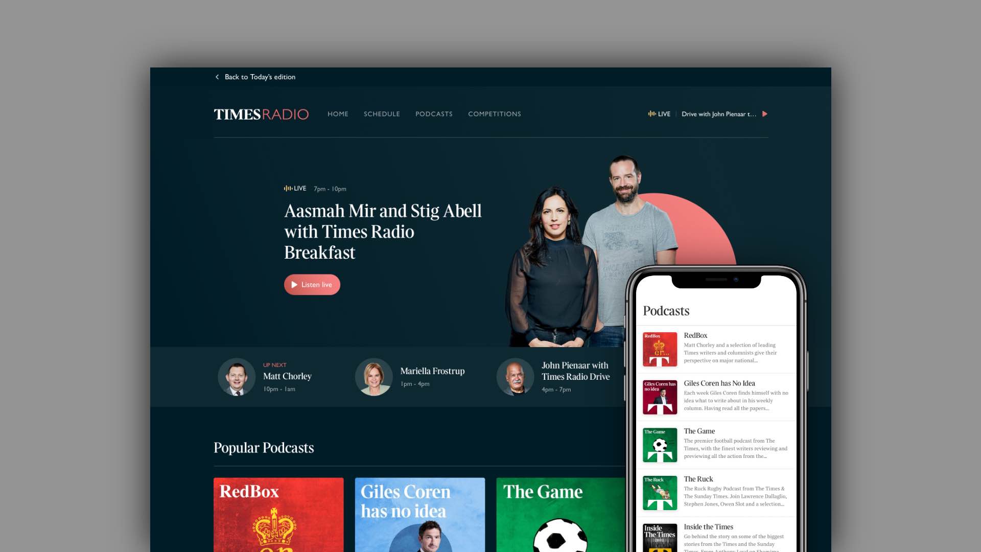
Due to the short window for which the proposal needed to be tested and then handed over to engineers, going straight into a medium fidelity UI prototype allowed me to be highly tactical with gaining solid data for testing with close to final product design, whist getting me some ways into actually doing the UI for the final build. My decision to do this does not come lightly; going straight to a higher fidelity can often sometimes waste more time in the ideation stages of UI without something lo-fi, often in the form of wireframes, to go on. I do sometimes find myself defaulting to this method of ‘straight to med fid’ even when I do have the time to go through the fidelity’s. In those scenarios I have to give myself a stern reminder of why I hold on so tightly to my design process. Fortunately with taking a very minimal but highly functional approach to the design, this was not the case and working at med fid provide great insight whist already giving engineers something to work from for the Beta product.
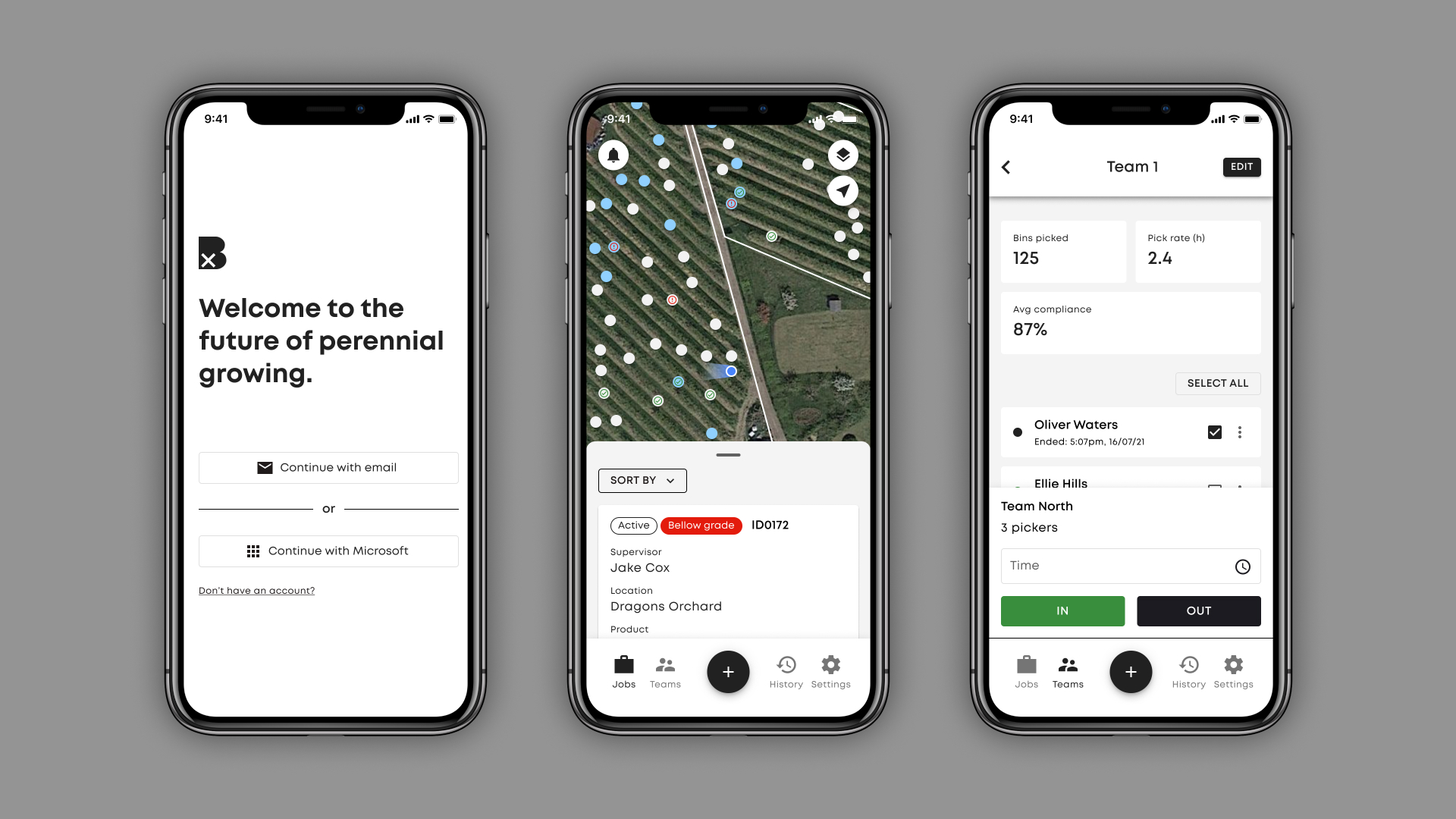
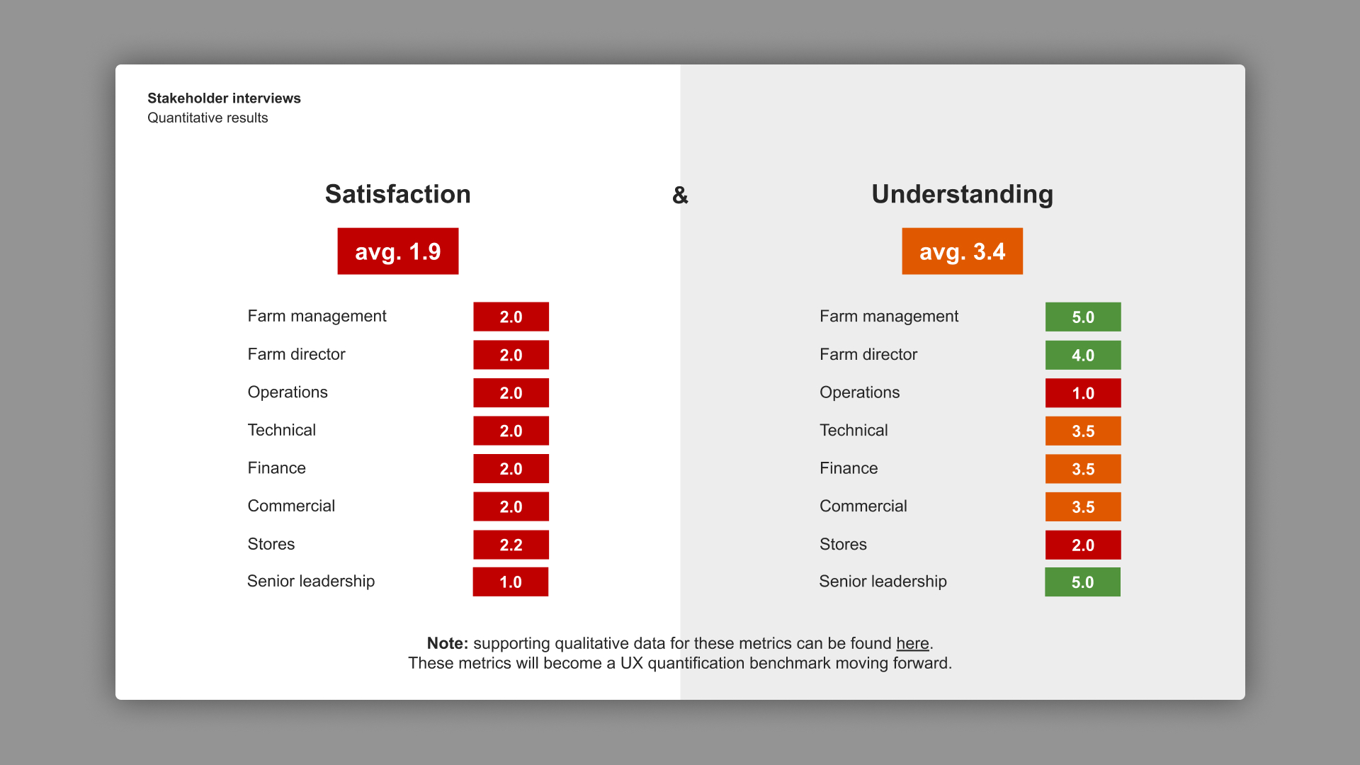
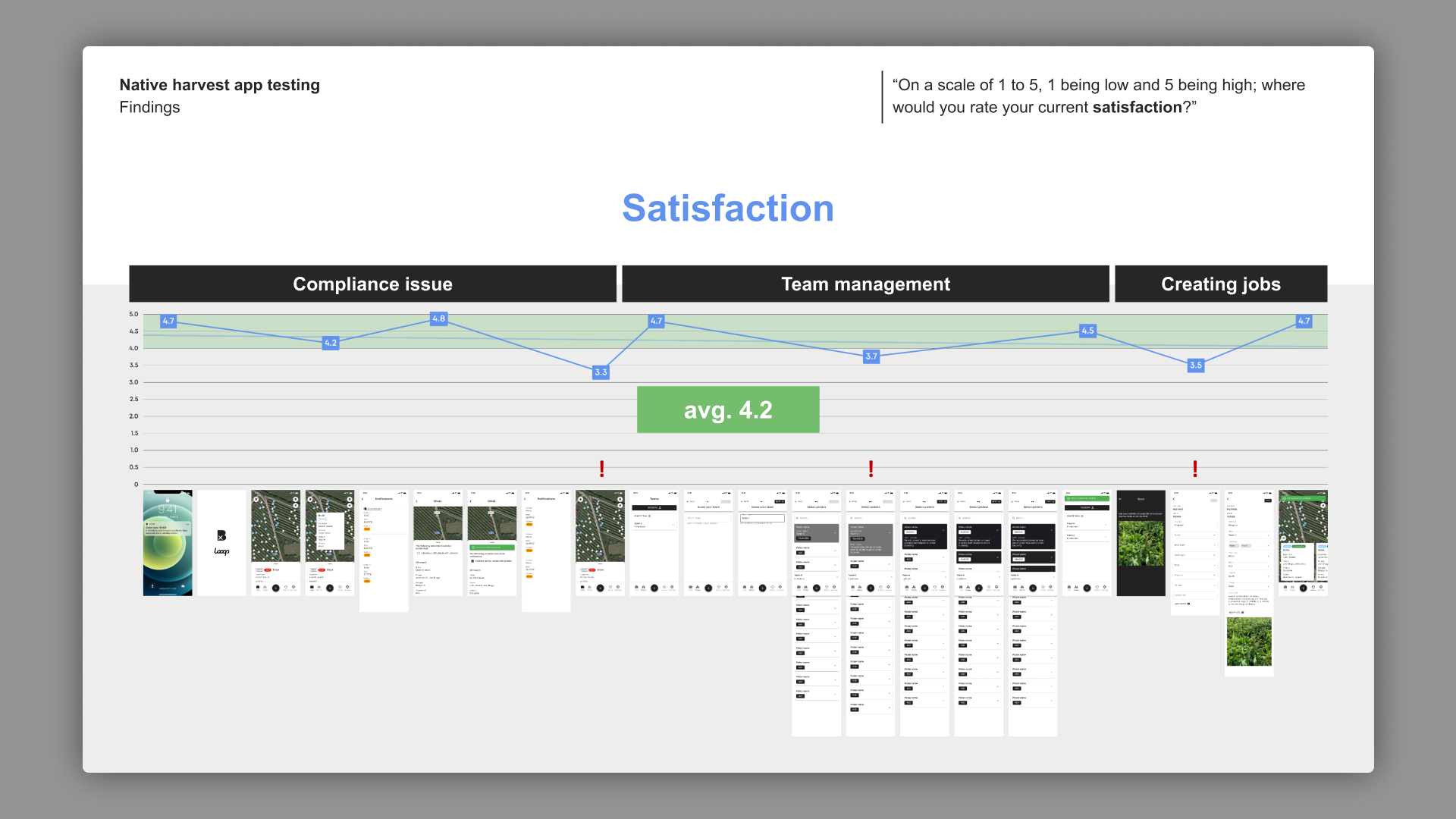
Testing for the Grower App was very hands on. This testing day saw me travelling on site to an active farm in the countryside of Kent to run multiple sessions face-to-face with a range of our working personas. Remote sessions were also held over video call with individuals who did not manage to make it on the day. The above image is an illustration of real quant that was capture across all tests for the metric of satisfaction. Satisfaction and understanding are my two core metrics that I hold on to as a product designer. Other metrics are used in specific briefs to answer specific questions, however these are my two go to plaines of insight. These metrics in quant allow me to speak very high level to either success or possible improvement of a prototype. Analysis of the dips in quant, as seen in the image, then allow qual to be dug out retrospectively from the session to provide further insight to why the prototype performed that way, and for me to understand how it can be improved in the future.
Users show great dissatisfaction towards losing trackability of a bin, even if this bin is considered bad or errored.
All users expressed a greater access to picker statistics; however, these statistics should have a considered time and place of access.
Although high value was seen in ‘forcing’ pickers from teams, the terminology was not embraced and the interaction itself was too easy to perform.
Users show dissatisfaction to repeatedly having to enter data and desire means to bulk assign data in a scanning session.
‘Register’ functionality was not understood by all users, however the feature was embraced when prompted.
Poor understanding was seen when users successfully created a job and were taken to their ‘History’. Most expect to be taken back to the ‘Jobs’ home screen.
Take a look at the full testing playback to learn more about this stage of the process.
View deckAs mentioned previously, the time for which I had to deliver hand over ready documentation for the design was very tight. I chose to prioritise testing over the final quality of the UI in this instance. The value proposition of the whole app itself, as apposes to the mechanisms that would be used to power it, were under greater scrutiny in the business at the time. In my role I always look for opportunities for where I can add value within a team. In this instance, the initiative was take to put insight first over aesthetic UI.
Unfortunately, the business was not at the stage of design competency where we had a working set of solidified brand foundations that could be wrapped into our baseline design system of Material UI. With this being said, I chose to pull together a set of foundations that would be serviceable as a white label until we were at the point where we could introduce a more rounded and justified set of foundations that could speak to both the business and our products. As much as possible was done both on the design and code side whilst working collaboratively to maintain that when this time did come, our existing component library’s would embrace the new theming and have parity at all points across product.
As part of the final handover, as well as component documentation, a full experience map was pulled together to outline sections of functionality and the flows/sates that powered them. This document was again key to providing insight to what was being built and why when considering the understand of lesser technically experienced individuals.
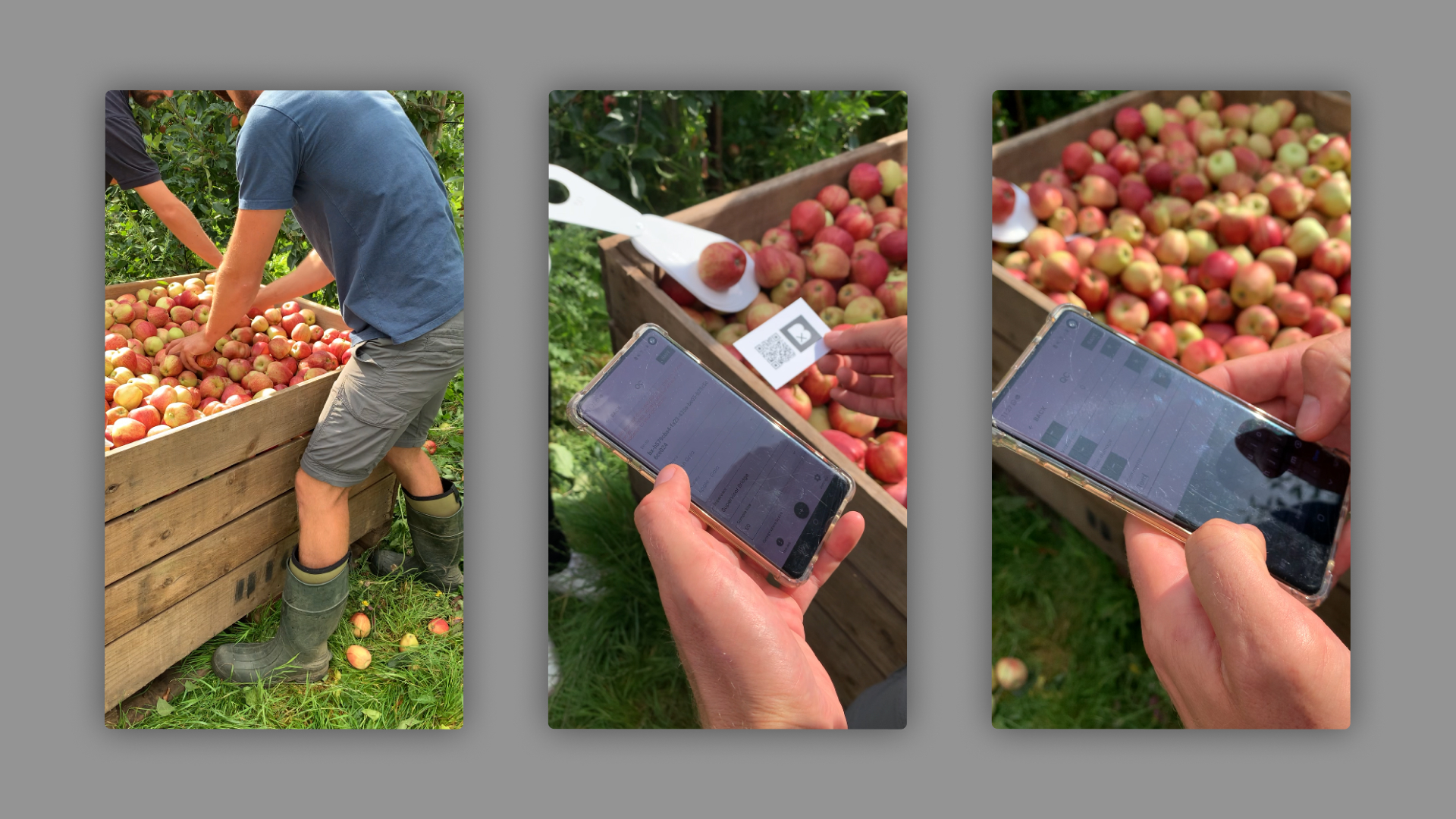
It isn’t often that you get to say that your ‘in-field’ testing was actually in a field. During our incubators apple harvest session, traditionally the most hectic time of a growers year, we chose to introduce our app in beta to their supply chain to gain insight to future development whist also testing their uptake of the new tech.
The above image shows one of one user getting hands on with the quality control (QC) module of the Grower App. This piece of functionality allows QC personas to digitally record the quality of produce that is being picked in the field. This information can then be aggregated into dashboards where by senior individual is the business can then report live the percentages of stock available in their business. Ultimately, if a grower understand their yield and quality as soon as possible, they can make a good guess at how much they are going to get paid for their produce ahead of time. This data is vital to not only increasing margins for a grower, but incentivises them to adopt more data first approaches in their business. In tern, this allows greater steps forward to be made in encouraging growers to consciously and actively engaged in removing emissions from our atmosphere once insights can be made from their data rich organisation.
In field testing was incredibly fun. Both myself and the engineering team went down from London to the farms in Kent to perform the testing, laptops and mobile devices in hand. We found ourselves amongst the chaotic scenes of an apple harvest in the late English summer. This not only made for a busy day of trying to collect data, but also provide real insights to how intense the scenarios our app was going to flow through. As product designer, I was on hand to run users through impromptu testing sessions, capturing their feedback and relaying back to the engineers at the centre of the harvest logistics point (aka a trailer and a festival toilet). This feedback was then thrown straight back into code with engineers working sat on the back of a trailer. Very much ‘in-field’.
Retrospectively I wish that much more planning went into this day. We found ourselves often with insight that was only stored in either our brains or the notes app of our phones. Although quant was obtained, it wasn’t recorded for prosperity meaning we couldn’t track against benchmarks or plot over time to record the delta. If greater thought had gone into what our hypothesis were and how we were going to try and answer them, we would have received much higher quality data, and thus been able to highlight the most impactful areas of improvement to implement. Key takeaways from this personally would be to always be ready to collect and collate feedback data. I am confident that I can run a great session, however the methods for which I structure and capture data can be much better.
I throughly enjoyed my time spent working on the Bx Grower App. Although incredibly time sensitive at stages, I feel that the work I outputted and in tern the learnings towards my development I made, where both of incredibly high value. Being the only designer in a good sized product team who are all pulling towards the same goal, gave me a great opportunity to own a large voice in the steer of the product. This is something that I have come to learnt is very much a strength of mine and a skill many individuals I have worked with see value in collaborating alongside.
From a technical perspective the Grower App was a success. For the amount of resource that we had in comparison to the amount of functionality we were tasked with delivering, we went above and beyond what we on paper should have achieved. Unfortunately however, the app commercially was not a success. Much of the ultimate success of the product was reliant upon a business leader strongly implementing and upholding this implementation of our product into their business. Within our early iterations, very little value was provided to data input personas, thus meaning little incentive to input the data at all. This then meant no insight was being surfaced to senior individuals and thus implementation of the product throughout the supply chain ceased. Retrospectively, this was always a concern from the product team, however we did not have the resource to question the overall value exchange, especially when considering input personas, to great enough extent. Other factors such as external business delivery agreements meant failure in delivery of the product was not an option, and so we had to focus on building with still a great deal of assumption. Ultimately, the project was set aside and placed on hold.
When reevaluating this project, it is clear that we did not have a good enough understanding of the hypothesis that we were trying to solve. Even though a hypothesis was present in loose terms, there was little in the way of a measure point to which we would stop and evaluate performance of our loose hypothesis. These are learnings that I have taken forward with me in projects following this. Although stepping sometimes out of the bounds of a traditional product design role, building a clear and logical product strategy is a skill that I have cultivated and have seen great value in providing. If we were to have this strategy when kicking off the Grower App, I would hope that we would have been much more focused on delivering the right value in the right places and ultimately see the product succeed in its uptake, or have the data to know its not going to plan and see its time to pull the plug, sooner rather than later.
I would like to take the opportunity to thank the individuals who I collaborated with to produce this piece of work. It was truly a pleasure to learn and grow along side some of the most talented people I have had the pleasure of working with. During the project we fostered a great presence of psychological safety within the team that allowed us to feel present and confident to work with challenging problems. These skills of working in a high performing team are ones which I will take with me throughout the rest of my career and beyond in to my day to day life.