Creative Showcase
- UX & UI Case Study -
- UX & UI Case Study -
Designed to serve as a Behance style platform, the Digital Showcase allows University of Lincoln creatives to present their best work, all in one place. Partnered with the Lincoln Festival of Creativity, the showcase provides a digital platform to said festival content, promoting Lincoln creatives to not only the greater student body but also to potential post graduate employers.
The following is an outlined summery of the design process that occurred over six weeks from March to April 2019.
Prior to designing actual wireframes, understanding what the client wanted from their briefing documentation would be key to producing a product inline with the clients scope. Researching exiting products gives insight to features, layout and functionality which could be included within the platform to produce a highly functional and usable end result. This research can then be shared with stakeholders to give them confidence in both my own ability and the platforms future direction.
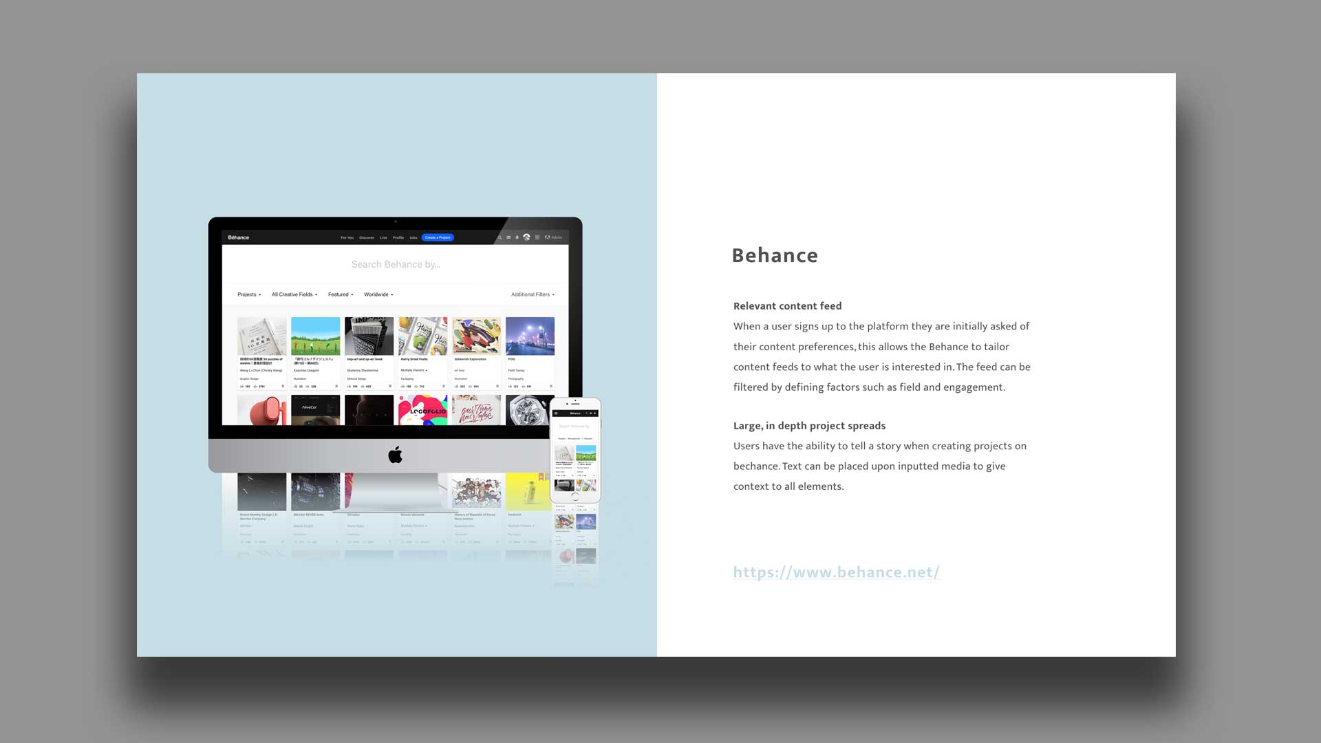
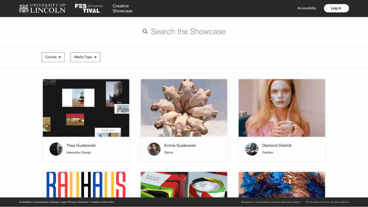
Content is randomly generated against a visitors preferences allowing them to see new and relevant content at every single page load.
Competitors feed filters allow content to be filtered by project types (single or multiple creatives), creative fields (media), their popularity and location.
Providing a space for individual creatives not only refines content for visitors but also gives creatives the opportunity to advertise themselves with external links.
Competitors provide creatives the opportunity to include multiple creatives to be owners of a project, promoting collaborative work.
Competitors use a small, fixed footer to provide a global ownership and typical footer functionality when implementing infinite scroll.
Loops are utilised at the end of content to provide greater journeys on platform for users.
The following deck outlines this process in detail, pulling out key pieces of functionality that would be key to a successful platform.
Take a look at the full discovery playback to learn more about this stage of the process.
View deck
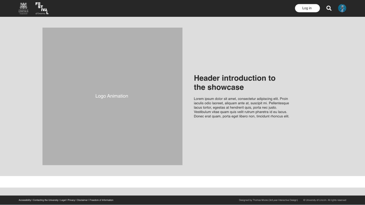
Outlining the initial user journey from a global perspective allows not only myself but also stakeholders to have a collective understanding of the design. This aids the steering of design decisions from both sides and later helps developers to understand navigation layouts. Short page descriptions detail why the page exists and briefly the mechanisms it may have. This journey is very much open to iteration throughout the process.
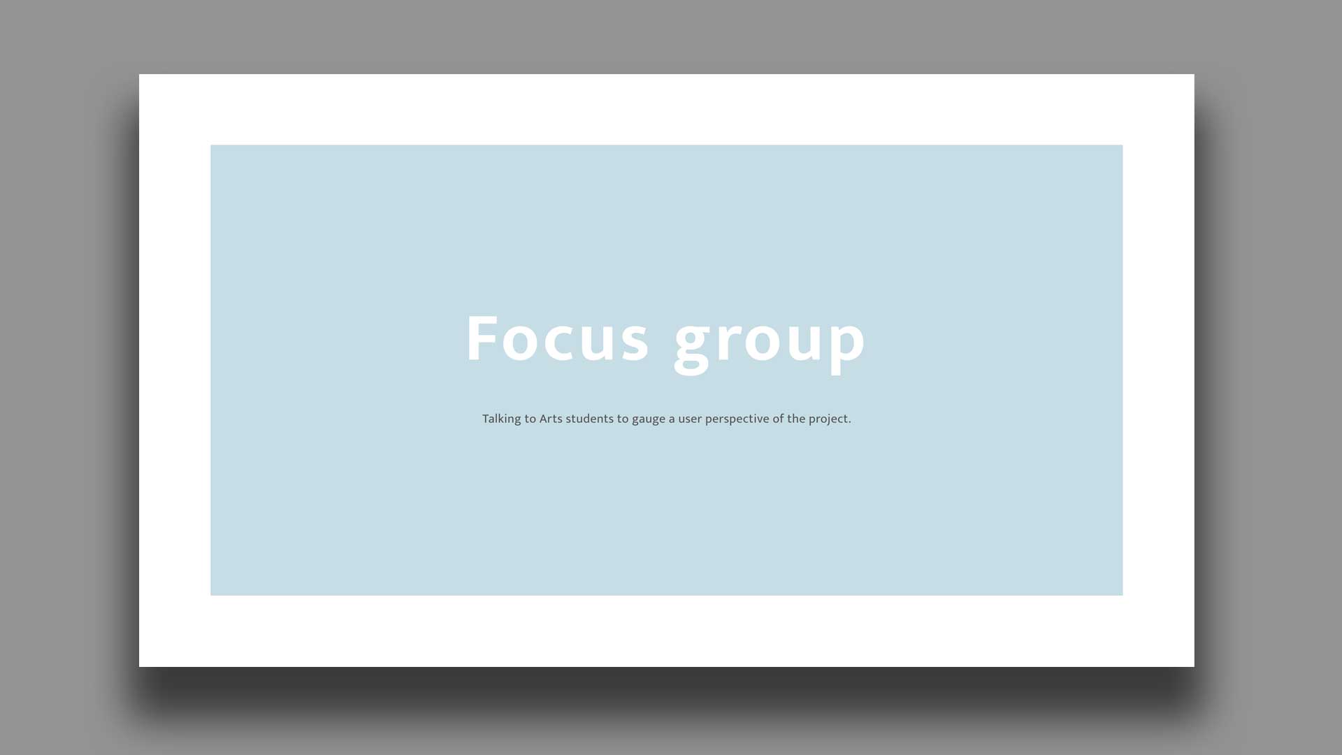
Understanding not only who our users are but what they want from our final product is extremely important, especially in projects such as this where content is generated by the users themselves. Sitting down with other creative students from all over the arts school gave great insight to different stress cases and usability scenarios across multiple creative disciplines. It is important to note that an understanding of ‘user needs’ vs ‘user wants’ has to be defined. Refinement of focus group feedback can be undertaken, effecting the scope of a brief in a manner that is compliant to stakeholder needs. Details of the focus group and its results can be found in the previously mentioned deck.
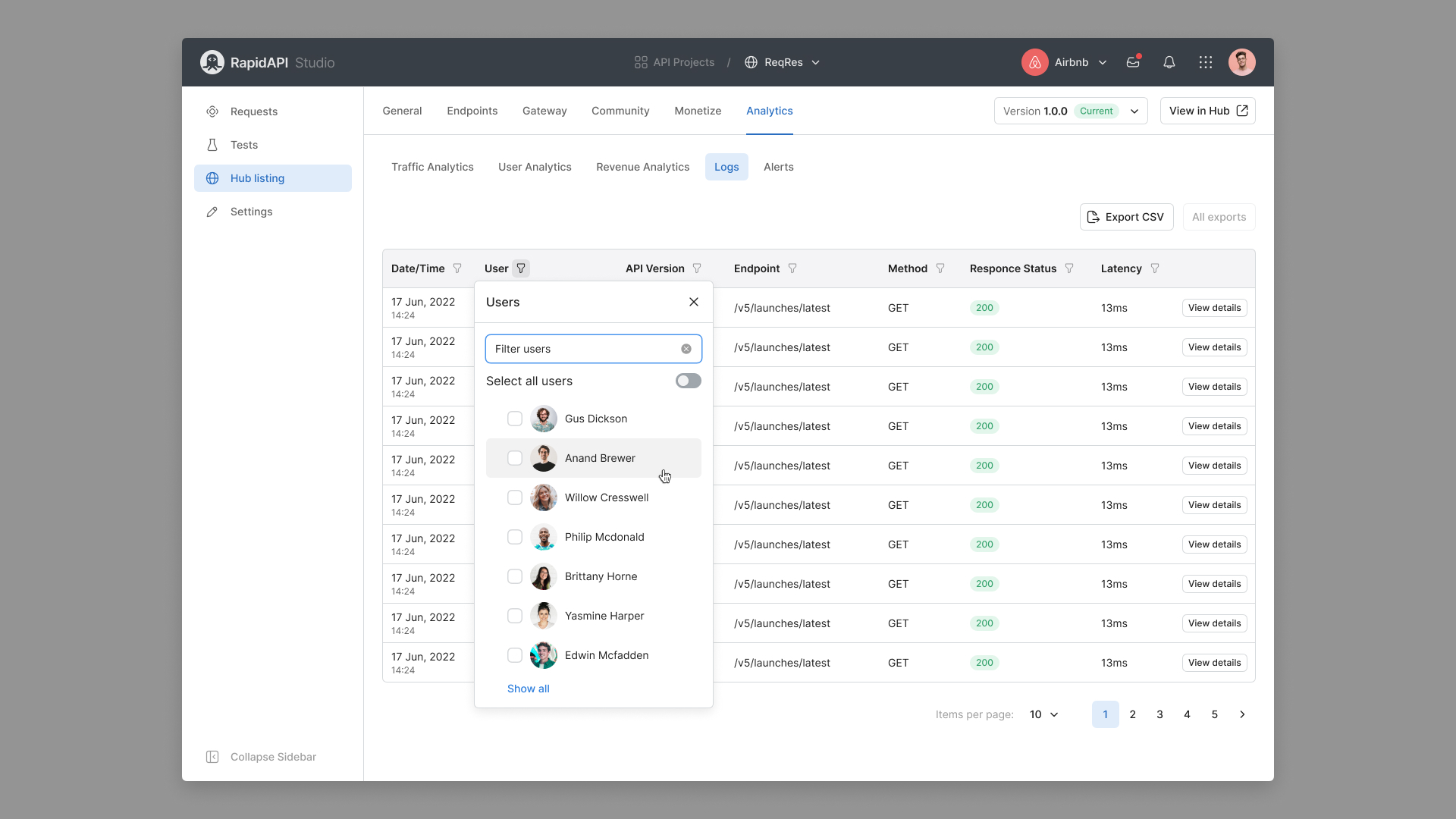
Students highly recommend the addition of dialog boxes to provide student context to work.
Already use social media such as Instagram to advertise snack-able portfolio content.
Will not engage with a platform unless there is an already established stream of content.
Much prefer to be part of, and engage with moderated content.
Need their work to be there for two years if they are to use it as a means of greater portfolio exposure.
Would like to credit other creatives to their work.
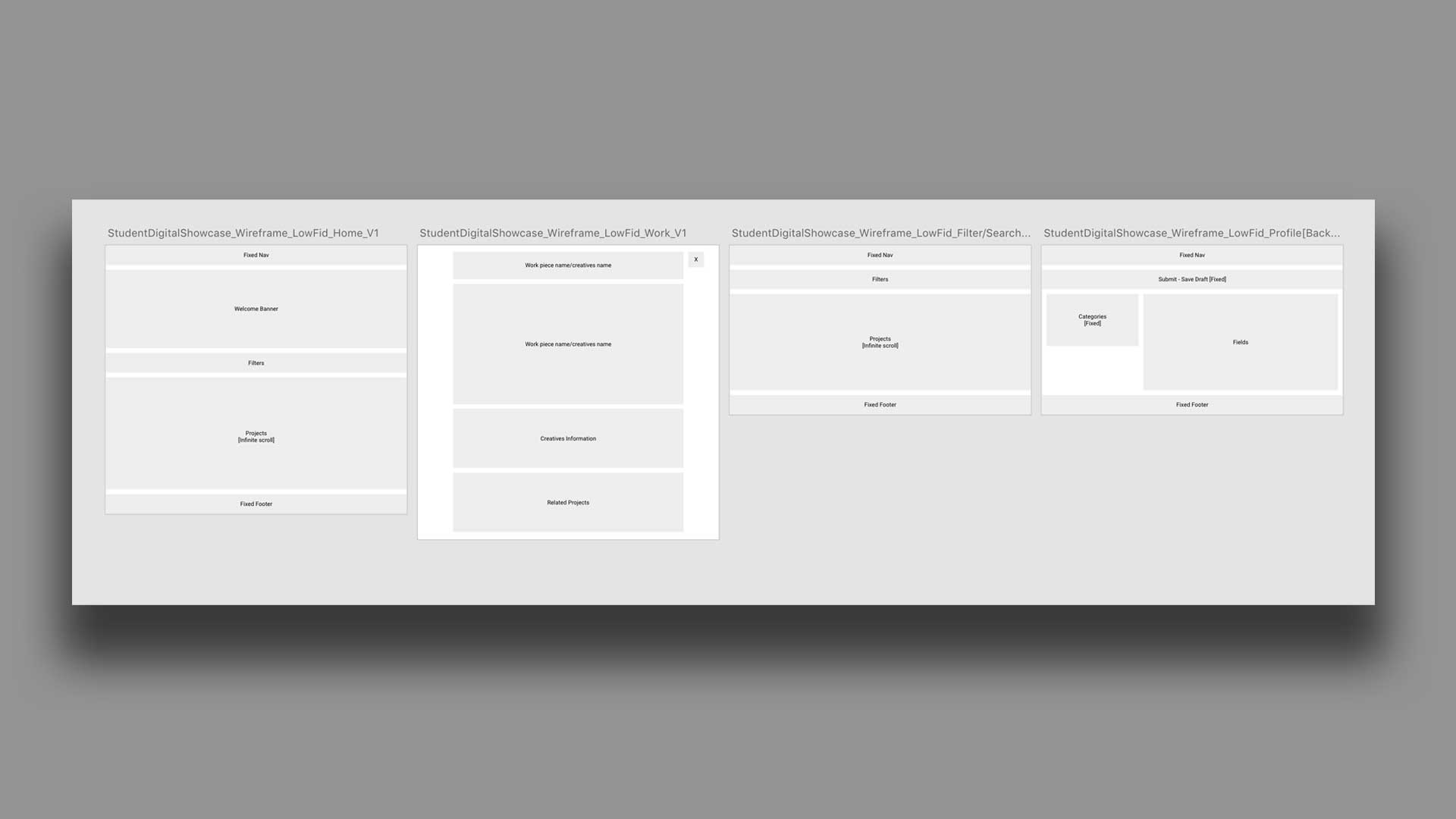
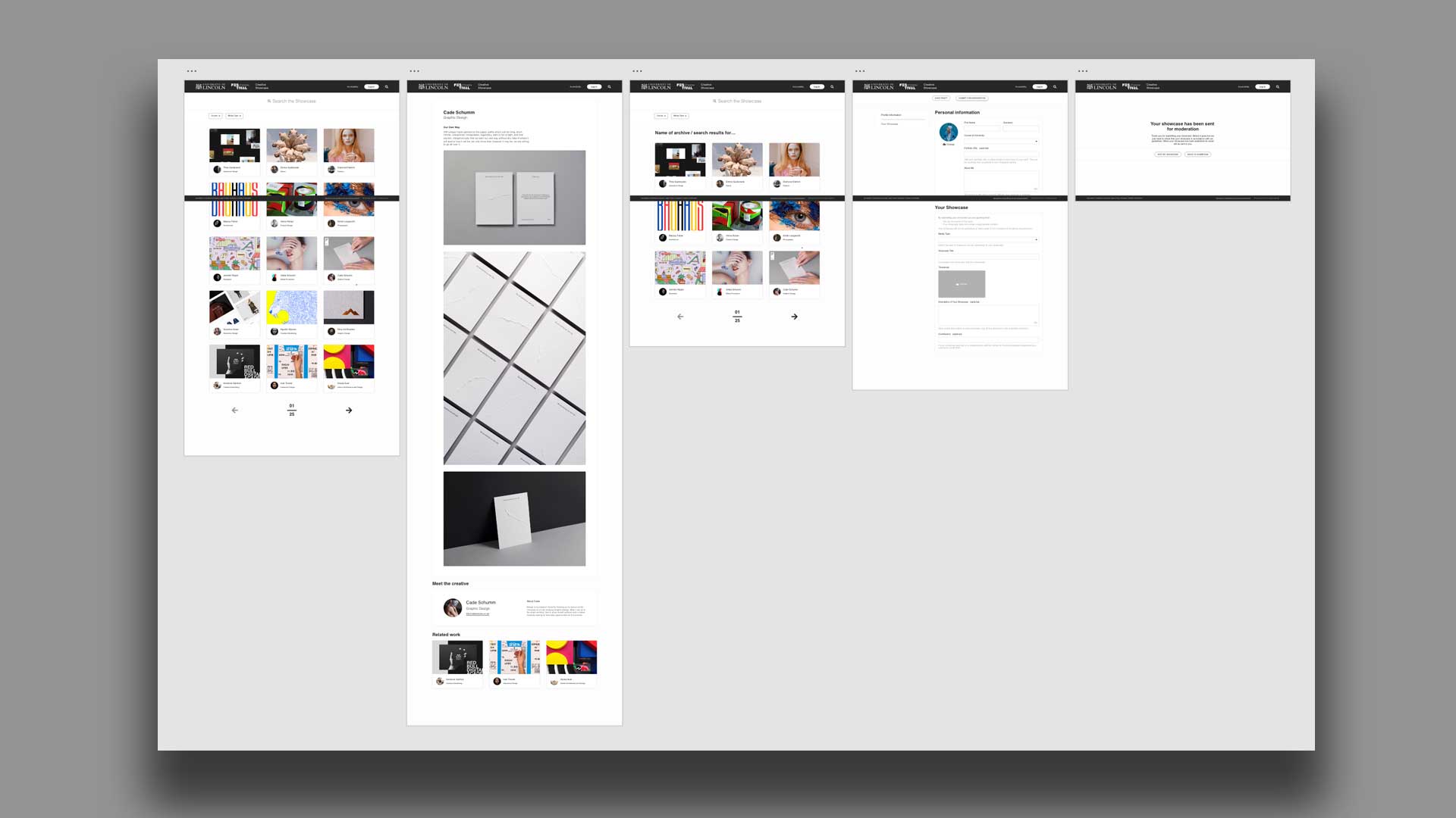
The output of low fidelity wireframes enables me to start getting in the mind of layout and mechanism/interaction. The bare bones nature of the design itself provides focus to the mechanisms and not the visual identity. This practice spills over into later designs up until the point where we are happy that mechanisms and layout are reasonably finalised.
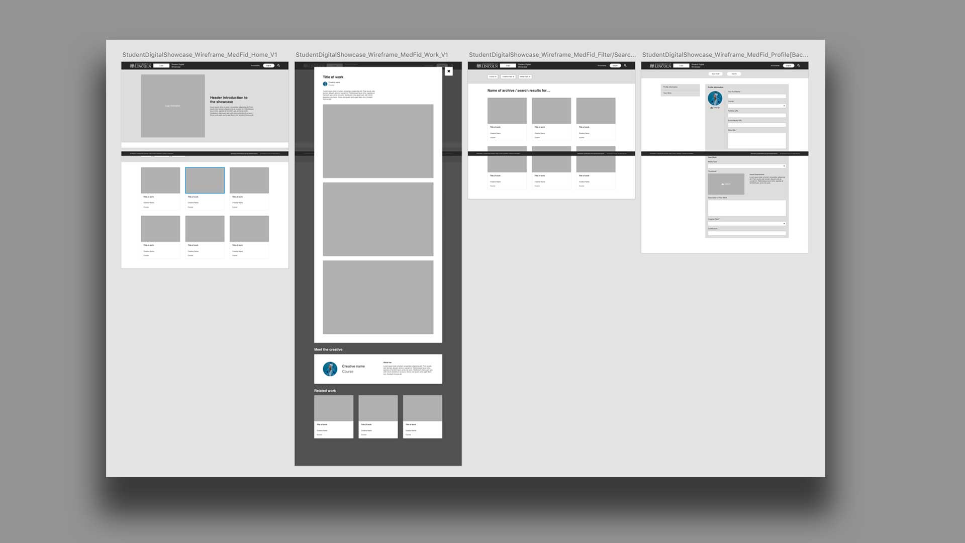
Moving up to medium fidelity allows mechanisms to be fleshed out in greater detail. Collaborative design principles were maintained throughout the brief; working along side developers with the goal of producing a highly functional and useable product. These wireframes in combination with supporting research provide reasoning to my decisions, allowing developers to understand the purpose of key mechanisms within the proposed platform. Their considerations are then worked back into my designs to promote ease of development and ultimately an achievable product.
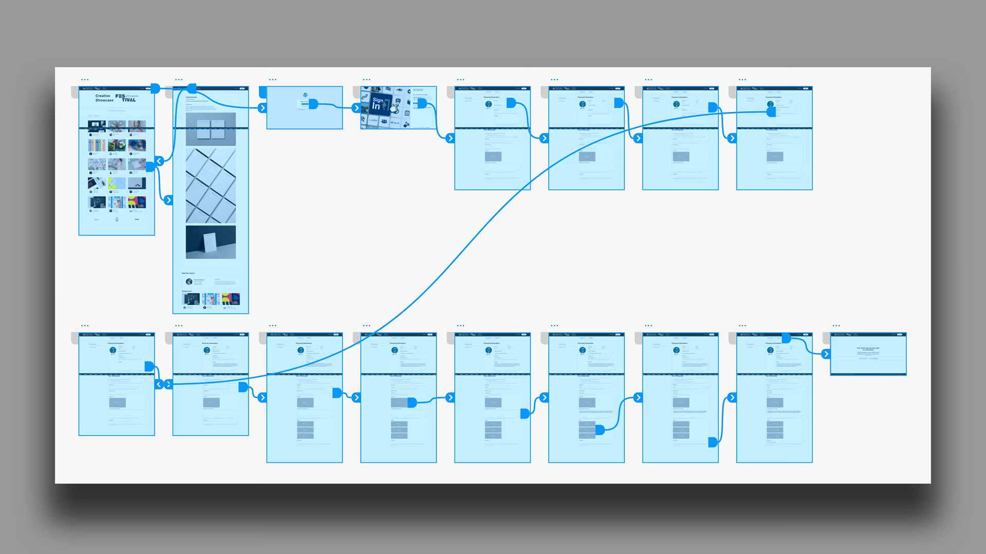
Producing a prototype allows stakeholder to bridge the gap between user journeys and wireframes. Allowing an individual to scroll and navigate through a piece just how they would in a browser allows people to reflect upon what they are seeing much more effectively. Please follow the link bellow to navigate to the actual prototype for this stage.
Feel free to have a click through of the prototype yourself.
View prototype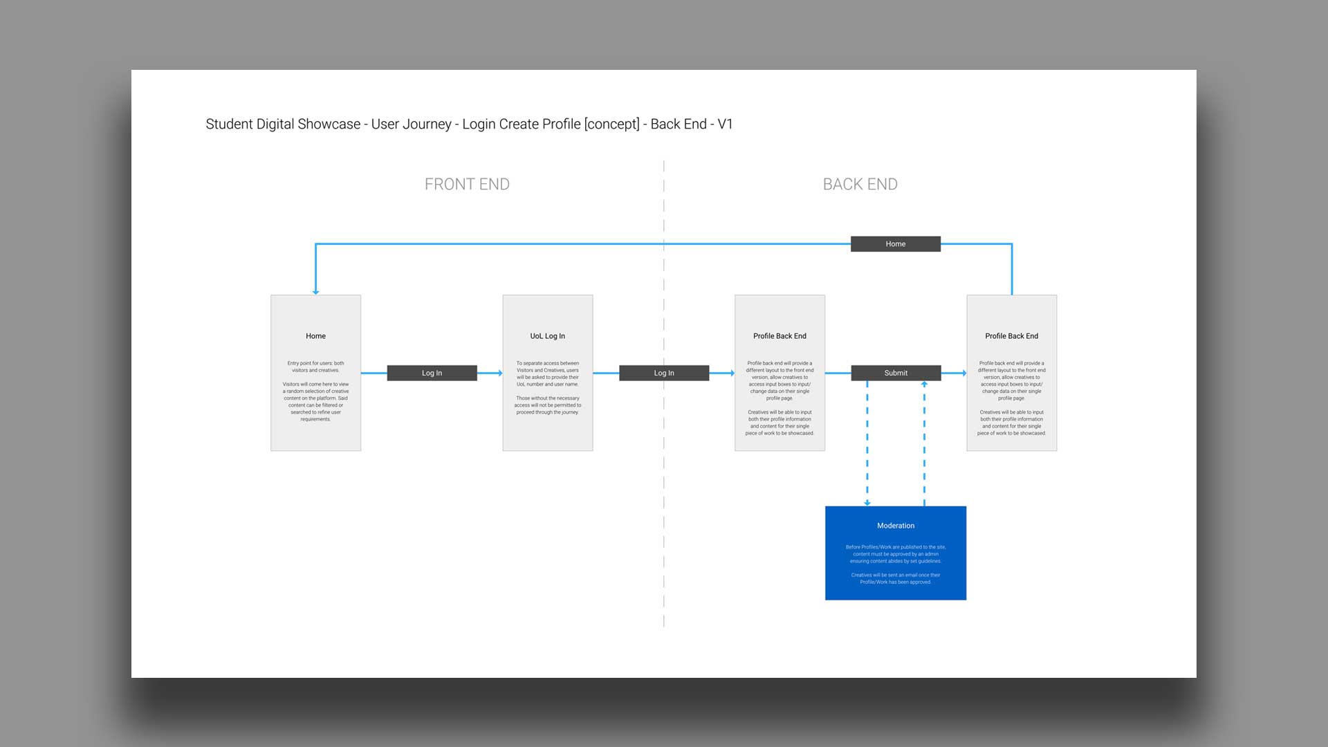
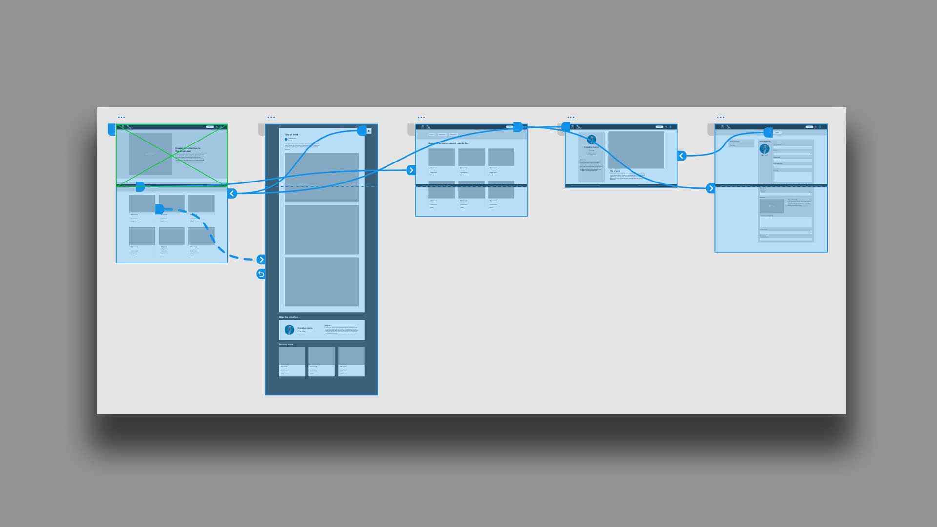
Due to this particular project being time sensitive, development time would be significantly constrained. Using pre-built system architecture meant that initially proposed global journeys would not be feasible but could be scaled back to reflect the level of available development resource. Outlining focused journeys such as the one above for the sign in and submit journey allowed for a mutual understanding between design and development to occur. This could then be communicated to greater effect to stakeholders from a design perspective, prior to actually proceeding with development.
Due to this particular project being time sensitive, development time would be significantly constrained. Using pre-built system architecture meant that initially proposed global journeys would not be feasible but could be scaled back to reflect the level of available development resource. Outlining focused journeys such as the one above for the sign in and submit journey allowed for a mutual understanding between design and development to occur. This could then be communicated to greater effect to stakeholders from a design perspective, prior to actually proceeding with development.
None of my work can be assumed as the correct solution until it is validated though user testing. A comprehensive and granular prototype was put together using the high fidelity wireframes to reflect both the proposed and realistic journey. A script to guide questioning is vital to maintain that my biases do not influence the user.
Positioning of searching mechanisms was not positioned obviously for users to find.
Recognition of journey location was low once a user had searched.
Form descriptions/guidance copy was well received but not accurate enough to produce comfortable success rates.
Users were unhappy that timeframes of moderation were not provided upon form completion.
Results from one on one testing sessions were shared with stakeholders and inputted back into the designs. One final round of testing took place after this to revalidate the changes.
Feel free to have a click through of the prototype yourself.
View prototypeOnce myself and stakeholders are happy with the final design, all documentation of the process was then handed over to our development team. None of the following process matters unless a effective handover to development happens and all members are happy with what has been produced. Documentation and fully functional prototypes were walked through in person with development teams to make sure the reasoning behind the functionality was fully understood. Although no longer under my control, I am still on hand through out development to answer questions and aid develops with functionality when needed.
Although the scope for this project was small, future iterations of the product would be implemented to update the existing specification. Future functionality were proposed at the conclusion of this brief (shown in deck), allowing design and development to quickly improve upon the existing product.
Thank you for following me through the design process of the Creative Showcase. Please do get in touch if you have any questions about this piece of work, or would like to see anything on show here in greater detail.